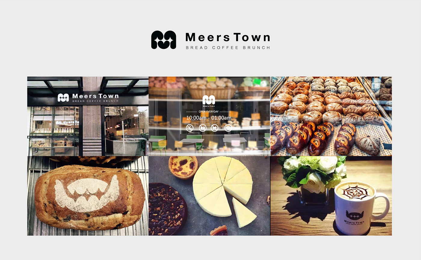
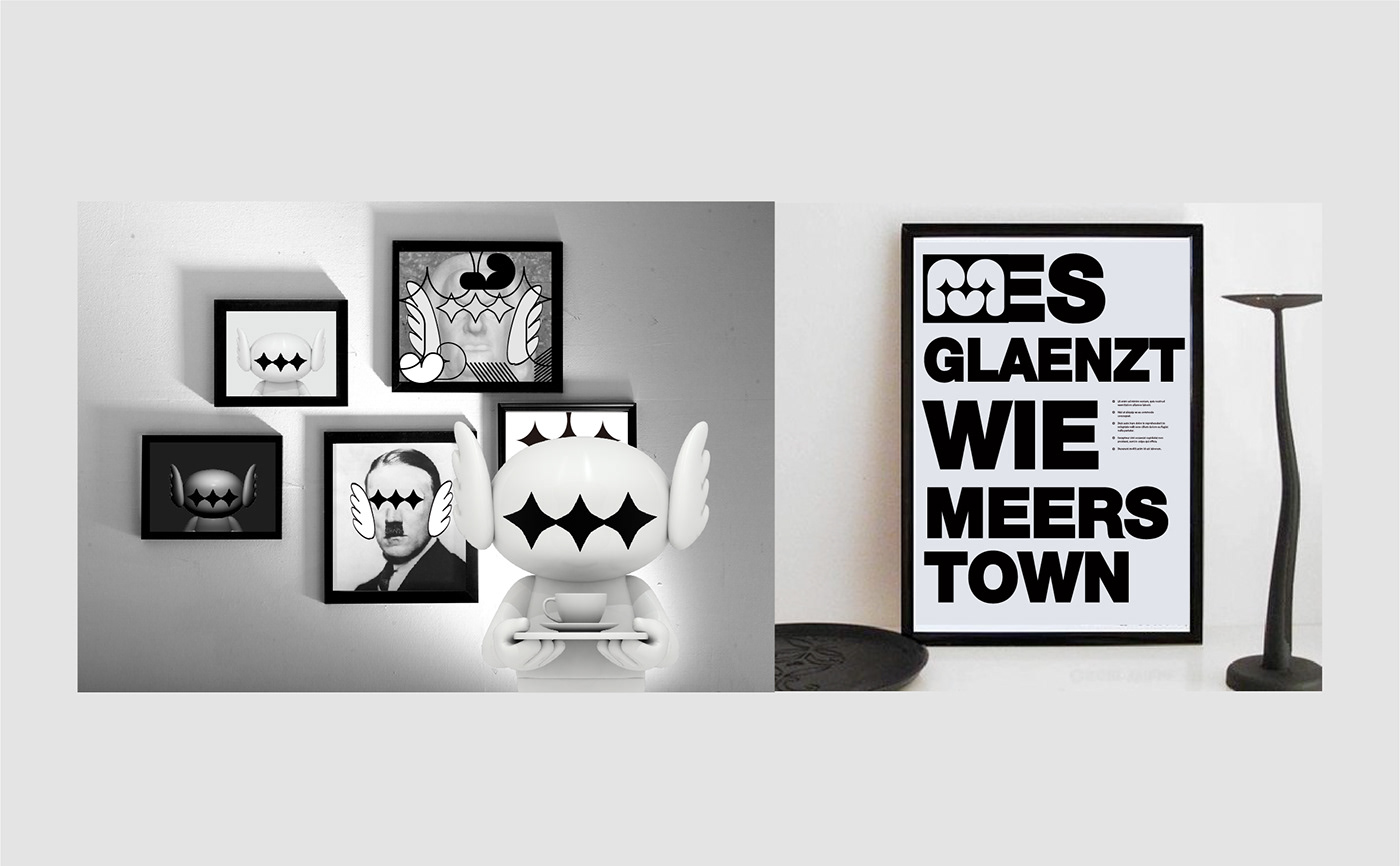
梅尔斯小镇位于德国博登湖畔,与小镇同名的梅尔斯堡,建于公元630年,是德国仍持续使用的城堡中最古老的一个。古堡傲然矗立在山上,映衬着山下博登湖明朗清澈的湖水,因此人们总是把梅尔斯堡看做是浑然天成的自然杰作,以至于当欧洲人在惊叹于漂亮美丽时,会说:“Es glaenzt wie Meersburg”(如梅尔斯堡一般闪亮)。
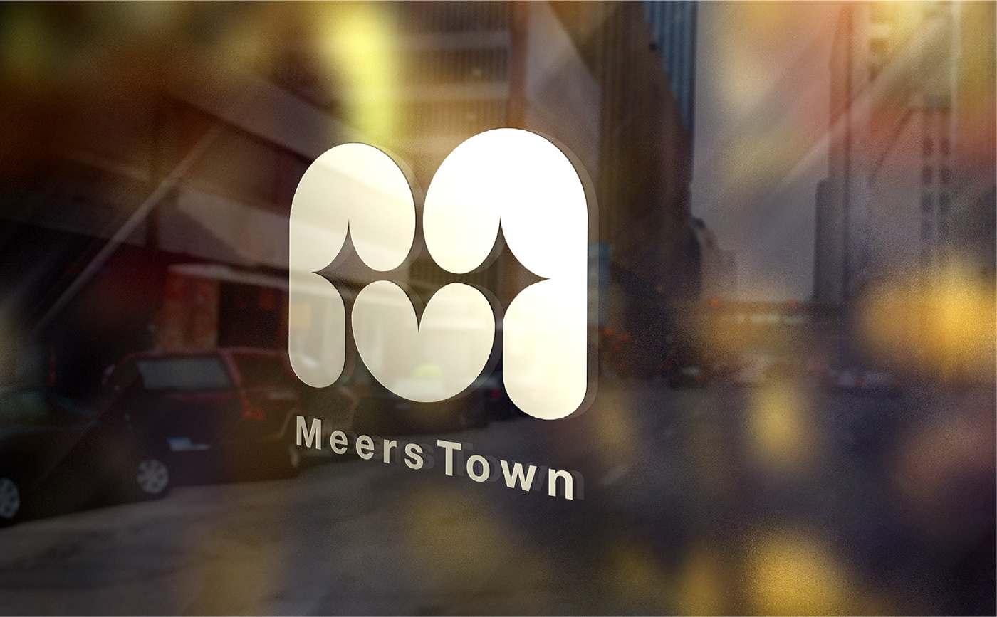
梅尔斯小镇面包店的Logo及IP设计灵感,即源自这种如星星般的‘闪亮’。我们将这种“闪亮”注入到品牌Logo大写M之中,并将IP角色的眼睛也变成星星,就犹如当顾客看到刚出炉的香喷喷的面包时,眼里发出垂涎三尺的光芒。
The town of Meers is located on the shore of Lake Constance in Germany. It has the same name as the town of Meersburgthe oldest castle still in use in Germany. he clear waters of Lake Constance below the mountain people always consider Meersburg as a natural masterpieceo that when Europeans are marveling at the beauty, they say: "Es glaenzt wie Meersburg" (as shiny as Meersburg).
uch as star-like shining”. We inject this "shine" into the capital M, and turn the eyes of the character into stars, just like when customers see the freshly baked fragrant bread, their eyes emit a salivating light.


Client : 梅尔斯小镇面包店 Meerstown Cafe
Concept : Ave Leung
Creative Direction : Ave Leung
Illustration : Ave Leung
Designer : Jin Leung
3D Graphic : Zhuang Yi


